

Surepath Insurance
This was a 4 1/2-week solo project exploring how to simplify insurance selection for young adults. My role covered user research, wireframing, and prototyping. The goal was to design a tool that made comparing policies easier and clearer.
ROLE
DURATION
READ TIME
UX/UI Designer, Branding
4 1/2 weeks
15 minutes

Users found insurance products difficult to compare, 7 out of 8 said the language was confusing and the options overwhelming.
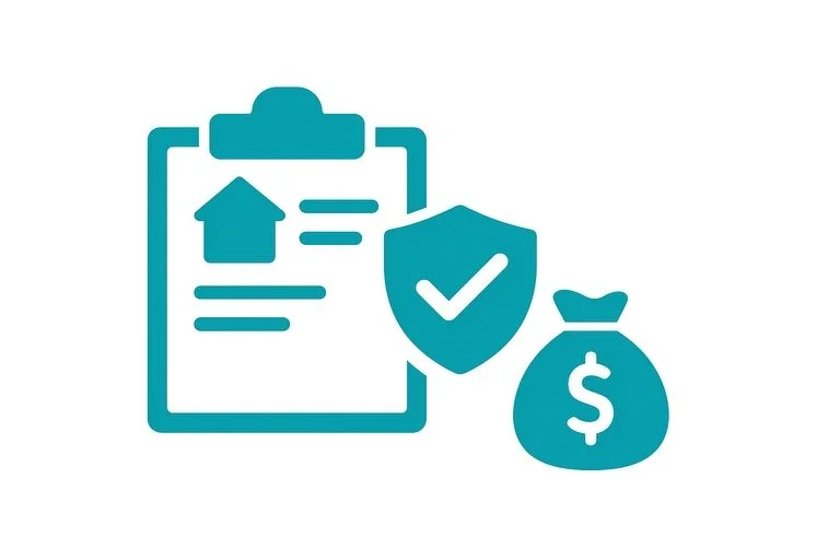
The Problem
During major life changes, they often struggle to understand how coverage is affected, and without tools to explore “What if?” scenarios, they’re left uncertain and frustrated.
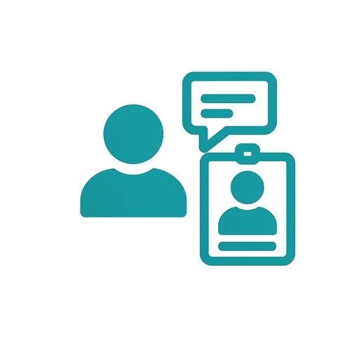
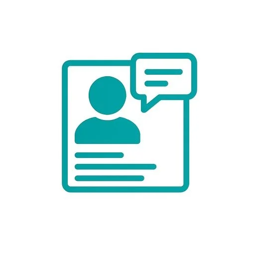
I designed a comparison tool and AI chatbot that turn complex insurance options into clear language, visuals, and guided steps, helping customers feel confident.
The Solution
Users can explore “What if” scenarios, understand how life changes affect their coverage, and get tailored recommendations with ease.
The Outcome
The guided conversations not only answered their insurance questions but also presented relevant options, helping them explore coverage possibilities and even complete a purchase directly within the chatbot if desired.
Research Methods
-
Moderated Video Interviews
Through Google Meet interviews, I uncovered the challenges users face during life changes and how they behave when seeking insurance.
Outcome
User interviews revealed trust issues around jargon. Based on this, I simplified the language in key flows and tested with prototypes.
-

Prototype Testing
I conducted remote usability testing to assess how users engaged with the AI chatbot, explored their insurance needs and completed the purchase process.
Outcome
Prototype testing led to a redesigned homepage and tool layout, improving accessibility and delivering a more intuitive, user-friendly experience.
-
User Persona
I created a user persona with an uncommon pain point to test how well the chatbot adapts to scenarios rarely addressed on insurance websites.
Outcome
Creating a user persona clarified chatbot interactions and revealed key user journeys, guiding the design of seamless, need-focused conversational flows.

Graphic Designer, Mid to late twenties Montreal, QC Single, no children
John Doe
John, a corporate graphic designer transitioning to full-time freelance, is exploring what insurance he’ll need. He feels uncertain about where to begin and prefers researching online before speaking with an advisor.
Goals
When comparing providers, John switches between 3–4 tabs, feels frustrated by unclear fees, and often abandons sign-up.
Pain point
John is tech-savvy and prefers researching on his own to make informed decisions. With a busy schedule, he avoids unnecessary appointments and dislikes waiting on customer service.
Relevant Patterns of Behaviour
Competitive Analysis
Most lacked interactive, personalized tools.
I reviewed key Canadian and digital-first insurers to assess how they help users understand real-life coverage scenarios.

Key Insights
Coverage Explained with Examples

General Support Tools

Extensive FAQs

Tailored coverage insights for specific life changing situations

Competitors
-

Intact Insurance
Strength
Uses AI, digital tools, FAQs, and human advisors to support customers.
Weakness
Client Centre lacks a tool to input life changes and see coverage updates, creating a guidance gap.
-

Desjardins
Strength
Offers a virtual assistant with coverage suggestions and budget planners to guide users.
Weakness
Tools aren’t personalized—no simulator or AI chatbot, and human support is limited to set hours.
-

IA Financial Group
Strength
Provides digital tools, AI guidance, FAQs, and consultations for clearer coverage.
Weakness
Compass tool isn’t AI-powered and redirects to other tools, adding extra steps and complexity.
-

Chat GPT
Strength
Adapts to life scenarios, simulates outcomes, and offers personalized guidance.
Weakness
Separate tool that adds extra steps instead of guiding users directly in-app or on the website.
-

Replika
Strength
Engages users in human-like conversations and adapts for a personalized experience.
Weakness
Limited to emotional support; doesn’t guide users on insurance or optimizing their experience.
Users typically begin by typing keywords into the search bar or scrolling through the insurance page extensively to find what they need. Some will schedule a call with an advisor, though this is less common. Very few choose to call customer support, as they find the long wait times and complex automated menus frustrating and confusing.
Insights from User Interviews

Next Steps
Next, I’d run a usability test with a broader group, refine the quote flow for mobile, and explore how to scale this to multi-policy bundles.
User Flow
Designed a user flow that mapped key interactions with the AI chatbot, guiding wireframes to ensure a smooth and task-focused experience.
Design Guide
-
![]()
Logo (icon)
-
![]()
Logo (full logo)
-
![]()
Primary Colour palette
-
![]()
Secondary Colour palette
-
![]()
Accent Colour palette


Wireframes
I created wireframes showing how an AI chatbot guides customers through life changes, helping them understand and select the right insurance coverage.
Sketches
Home Page
Simulator Tool Introduction Page
Home Page - Tool located
Simulator Tool Page

Testing Wireframes
After building the wireframes in Figma and testing with users, I quickly identified key improvements the chatbot and the home page needed to better support task completion.
Iterations
Solution
Iterations and a refined design guide highlighted updates from wireframe testing, giving users clearer navigation and a stronger sense of the final product.
Outcome
Updated components and animations streamlined navigation, helping users stay focused on their tasks.
Solution
Prototype
The prototype used subtle UI enhancements to improve legibility and accessibility, with colour guiding users toward key information and next steps.
Outcome
Users followed the journey with minimal confusion across tasks.

Conclusion
What I learned
A new tool/concept requires research and careful integration to fit the project.
Interviewing both experienced and inexperienced users revealed key insights to shape the tool’s user journey.
Clear scenarios and audiences enabled more meaningful user interactions.